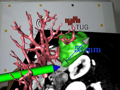
Looking at how technology has developed and how augmented reality can be used in an interactive sense, I have looked at augmented reality in surgery.I found this column quite interesting and how this 3D space can be explored to help people.

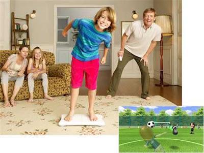
Another application that Nintendo Wii has brought out is the Wii board. It fascinates me how a living space will slowly be turned into a full on gaming atmosphere where a user is not just sitting infront and interacting in a game but actually an actor in the game.
The one thing I hope that will occur is that photorealistic gaming – such as Crysis on the PC will eventually become interactive like the Wii. I would never go outside again!
So the Wii Board…
Access information on how the user is positioned and the direction of weight distributed by leaning one way or another – quite like a skater.
Wii Fit doesn't currently use the Wii Remote for gameplay, but imagine using a Wii Remote in your hand as a gun while leaning left and right on the Balance Board to take cover. Games could become a whole lot more immersive.
Comes with the Wii Fit collection include ski jumping. You crouch into a skiing position as the on-screen character shoots down a ramp, and spring up suddenly to leap from the ramp and then lean forward to get the biggest jump distance possible.
Another game has you leaning your torso left and right to make an on-screen footballer head back incoming balls. While another mini game gives you control of a tilting platform with rolling balls that you must guide into holes in the platform.
3D Monitors
This post will have a brief look at two 3D monitors from different manufacturers that will be on the market this year – and I am quite interested in! Really im thinking of the gaming benefits this will have but also for my line of work which is in 3D Visualisation it would again I’ll be pretty well off.
The first is a monitor designed By Zalman.
It uses polarisation rather than adding red and green, although special glasses are required. The vertical viewing range is a bare 12 degrees because of the nature of polarization. It blocks light so move too far off centre and things start to look strange. The horizontal viewing angle is a respectable 180 degrees so it's not all bad.

The second is by Sharp.
The technology is already used in Sharp's SH251iS mobile phone, on sale in 
Sharp demonstrated how the 3D monitor could be used to improve game play, by showing a demo of Quake where the terrain, monsters and other items appeared in three dimensions. The company also believes that its new system could have applications in sectors such as medical imaging and molecular modelling.
For this to work, the user has to be positioned directly in front of the monitor and at the correct distance away -- which appeared to be around 40 to 50cm.
"The 3D monitor should be launched commercially before the end of this year, priced at around 3,000 euros (around £2,000)," a Sharp spokesman said.
The prototype on display was a 15-inch flat screen. Sharp explained that the screen contained a 'parallax barrier TFT panel' that splits the light generated by the monitor such that alternate columns of pixels are seen by each eye, so that each sees a slightly different image.
 This is a button i created in Photoshop, it's a GIF image thats animated on a mouse rollover, and mouse down. Just because i can!

 Figure 6
 Figure 7. Rendering time 4 seconds.
 Figure 8. ‘Stitch Guy’ by Andrei Cirdu
 Figure 1. Rendering time 160 seconds.
 Figure 2. Rendering time 240 seconds.
 Figure 3.
 Figure 4.
 Figure 5. Rendering time 226 seconds.

 Above is the rendered image is a grassy knoll with a tree on top, it is clear to see the grass has worked and the opacity mapping has done its job. The light in the scene has also created a rounded looking knoll as can be seen with the shaded area to the left and the lit area to the right suggesting the a slope this will be implemented in the post rendered version in the next stage.Again following the structure of the previous water experiment the scene had to be set up ready for a grass texture to be applied in Photoshop to the right is the newly rendered image.
 The good thing about this sort of post production is that the grass that will be positioned onto the scene can be easily adapted from any image taken, a user would be able to easily choose what type of grass can be issued from a real world taken image that would in turn give the final image a realistic looks. For this event the image of the grass can be seen below.
 The results of this experiment were quite positive and so too was the feedback given by the peers asked. Although many thought that the 3D rendered image was quite realistic the individual blades of grass could be seen quite well to give an overall depth that they felt worked well many thought that the new post production image worked just as well. Due to the nature of easily being able to adapt a new grass layer a scene can drastically be changed and output can be produced quickly. The way that the 3D render was set using vast amounts of polygons the render took nearly two minutes. The success of this experiment is that both images have a realistic look to them in their own ways and the feedback given was not biased either way.
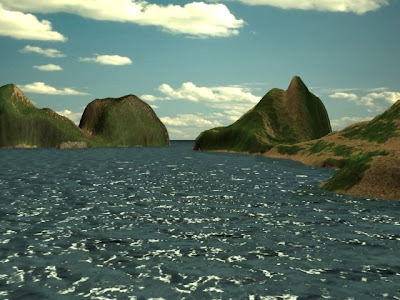
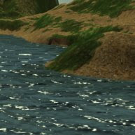 To allow a fair experiment to be issued the image had to be re rendered to not show the displaced water surface, instead the objects properties were stripped back to its original plane showing its original colour. This method will allow the post rendering Photoshop water to have the same colour properties and the only alteration will be the final output of the displaced water. Below is the render that is ready for use.
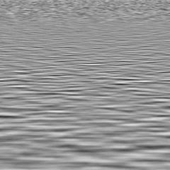
 To create the distortions and reflection of the surrounding that will make the water look like liquid a displacement map must be created and this will coincide with the distortion setting on Photoshop. To the right is the displacement map created for this purpose.This map will ‘shift pixels’ in an image according to the brightness values of the map. For example the lighter areas will shift these pixels more than the darker areas causing a depth effect in the image.However in Photoshop the channels area is very important as the first two channels are used to calculate the horizontal and vertical shifts of displacement. This advantage can be had by stretching one of the channels and leaving the other as the normal to create a random uneven look to the water.
 To create the water effect and the reflection of the islands the area above the blue plane that was not the water section was copied and then inverted vertically and a quick mask was issued on the same layer, this would allow the displacement map to filter through the layer and use the colour of the planethat was created in 3DS Max which in turn will have the same colour properties to allow for proper assessment.
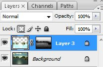 The key factors when using displacement in Photoshop is that it the amount that is produced depends on the initial map – both the amount of brightness issued and also the amount of distance between the first and second channels. Another factor is that there is an addition height and width instruction that enables a user to force the displacement map to stretch the layer that it has been placed on.
 Changing the amount of white light to filter through to the water was amended in the levels area of Photoshop, by selecting the white input levels and slowly moving them down the scale to the black levels the water can then be issued with the amount of light that falls onto the displacement map thus allowing the waves to have a various range and finally giving the water more depth.

 The black and white displacement map works in the same way as a bump map where the colour decides what section of a map will be displaced on an object. In this case the black area shall be unaffected whilst the white section will be altered. First of to see how the displacement alters an objects geometry a bump map will be placed onto the surface first and a comparison can be made.
 The bump map effects are very subtle, the objects surface looks like it has been embossed with peace sign and the black outline that has been created shows the difference in height. Now comparing this to the displacement map (note both the bump and displacement map are both the same to remain consistent) the embossed area looks far definitive and the height of the object can be seen more clearly than previously with the bump map. A fine quality that displacement mapping possesses is that when the object has been embossed the polygon count will be unaffected. This can be highly beneficial in a complex scene where there are many objects.
 At this point peers were asked if the displacement map looks more definitive than the previous bump map and all of them agreed, however a handful suggested if the scene had both displacement and bump maps present and this was done in the next step and the resulted render can be seen below.
 The same peers were asked if the new image gives the impression of being more realistic than the previous displacement map rendered image. As the bump map gives a definitive shaded area around the peace sign the geometry looks uplifted and embossed with more quality. The peers gave a similar contribution to my thoughts and are much more positive with the final result. From this procedure the results have been constructive the use of displacement mapping can significantly alter the geometry of an object without using more polygons which is a benefit as it allows a user to create complex scene with less effort for the renderer.
 Original chair with blocky shadow. Rendering time 2 seconds
 Below is of the image with the effects taken into account and the transparency has been set to 100%. Setting it to the upper limit will totally craft the black areas into full transparency whilst anything less will show a slight greyish tint where the black is and create a glass look which is not wanted here.
 Chair with Opacity Map and shadow. Rendering time 2 seconds. Polygon count 9,174.
 Chair with no opacity map and shadow. Rendering time 3 seconds. Polygon count 37,358.